


Since COVID-19 first arose as a worldwide health threat, millions of websites with maps charting the spread and prevalence of the virus have appeared on the internet. However, most of these maps do not improve public understanding of the potential risk of contracting COVID-19 or promote compliance with health guidelines meant to slow its spread, according to a new study led by University of Utah Health scientists in collaboration with other institutions.
In fact, the researchers found that study participants who didn’t see a map were more knowledgeable about the total number of COVID-19 cases in the United States than those who viewed one. They also found that maps did not influence a person’s perception of their own risk of contracting the disease.
“We know that people’s behavior and intentions are influenced by how well informed they are and how they perceive risk,” says Alistair Thorpe, Ph.D., lead author of the study and a U of U Health postdoctoral research fellow. “Prevalence maps are designed to help with that and so many have appeared during the COVID-19 pandemic. However, we found that simply presenting COVID-19 information in a map doesn’t necessarily have the intended influence on knowledge, perception, or behavior.”
The study appears in JAMA Network Open.
In a May 2020 online survey, the researchers asked 2,676 people, aged 18 to 91, to view one of six randomly selected maps of COVID-19 prevalence in the United States. Then, they were questioned about their knowledge of confirmed COVID-19 cases, their perceived risk of getting the disease, and whether they intended to adhere to COVID-19 prevention guidelines. A control group was not shown any of the maps and was simply asked to answer the questions based on their own knowledge without visual aids.
“The goal of this study was to try to find the best method for having people understand how common COVID-19 is nationwide as well as where they live,” says Angela Fagerlin, Ph.D., senior author of the paper, a U of U Health professor of population health sciences, and a research scientist at the Veterans Affairs Salt Lake City Health Care System. “We were hoping that understanding the prevalence of this disease would inspire them to take action to prevent the spread of COVID-19.”
Overall, those who saw maps were no more knowledgeable about the COVID-19 pandemic than those who didn’t see them. Participants who saw a map had lower perceptions of the risk to society; they were also more optimistic that the pandemic would be better in two weeks compared to those who didn’t see a map. None of the maps appeared to influence how participants perceived their personal susceptibility to the virus or whether they intended to follow public health guidelines.
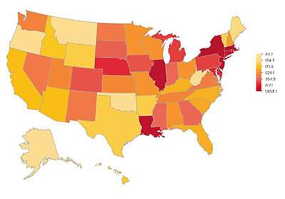
However, heat maps that depicted per capita cases by state in varying hues and intensities depending on localized prevalence appeared to be more effective than others.
“The features of these maps appear to be the most effective for improving or at least maintaining public knowledge of COVID-19 cases,” Thorpe says.
Among the study’s limitations are its reliance on self-reported information and potential barriers to participation, including lower English proficiency and limited or no internet access.
Moving forward, the researchers believe this finding could have significant long-term implications.
“There’s a lot of data coming out during this outbreak about how to effectively communicate health information that will help us in the next pandemic,” Fagerlin says. “I hope we can learn from this experience so we don’t have to recreate the wheel every time we experience a pandemic.”
Source: Read Full Article